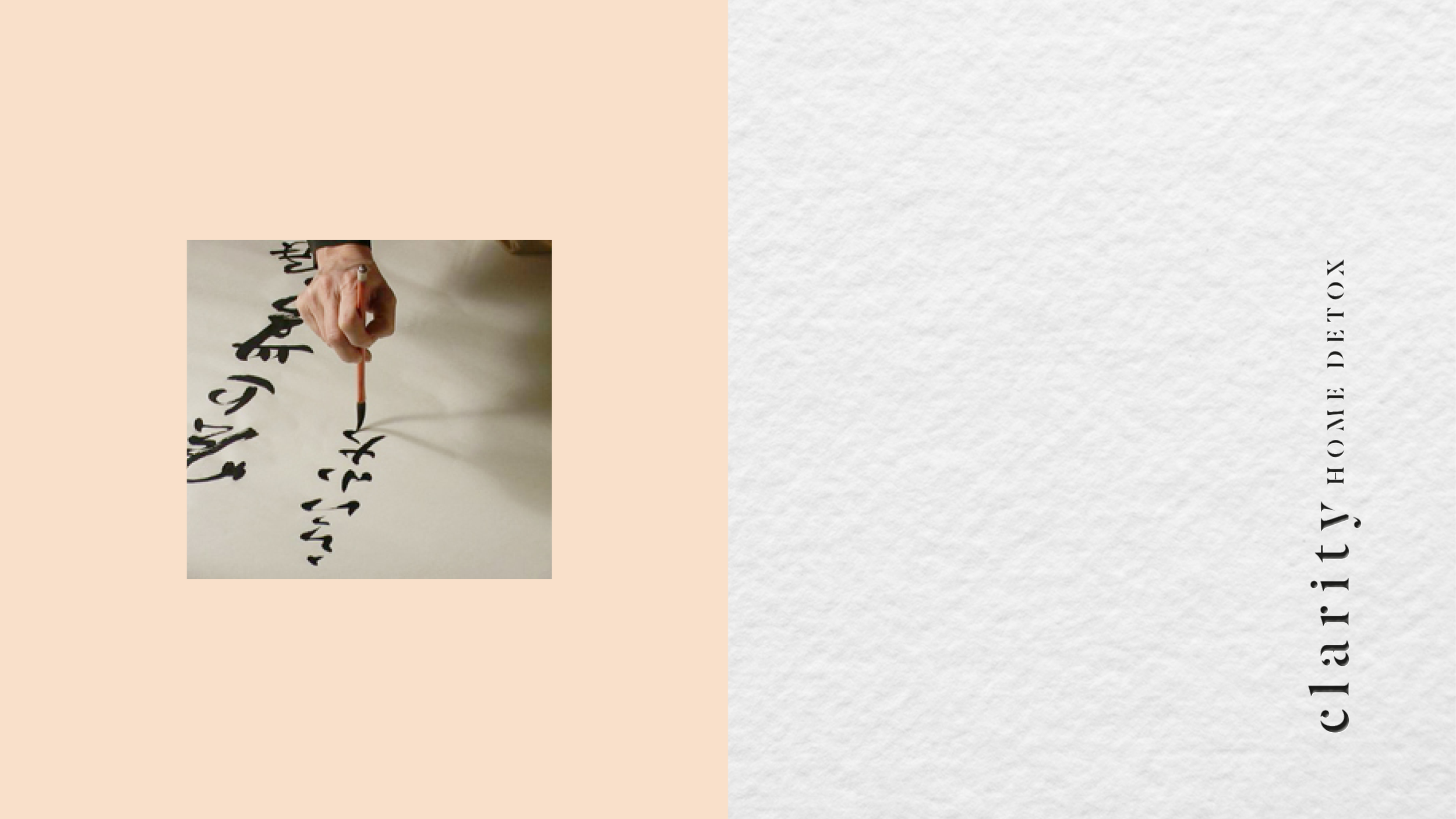
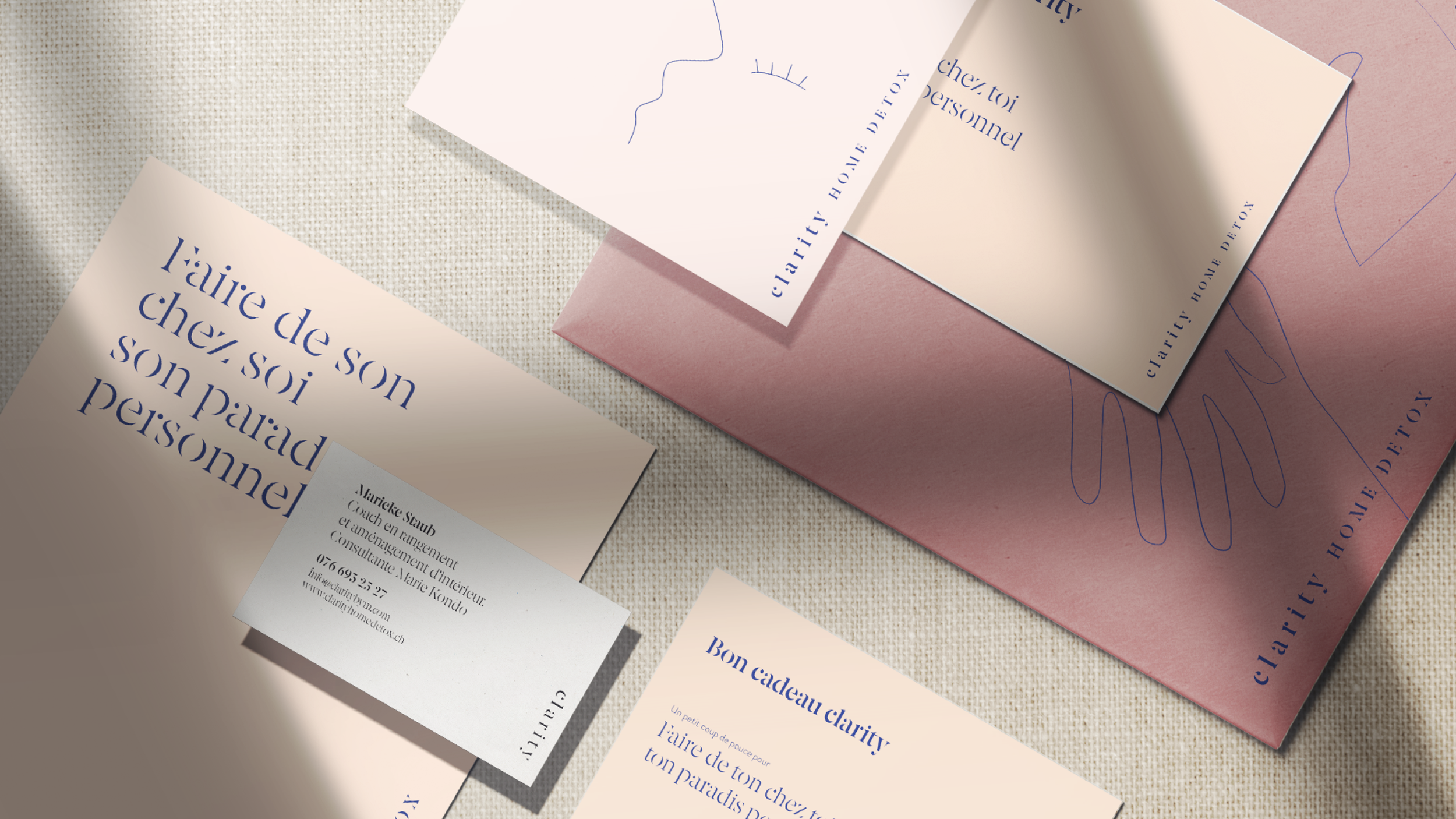
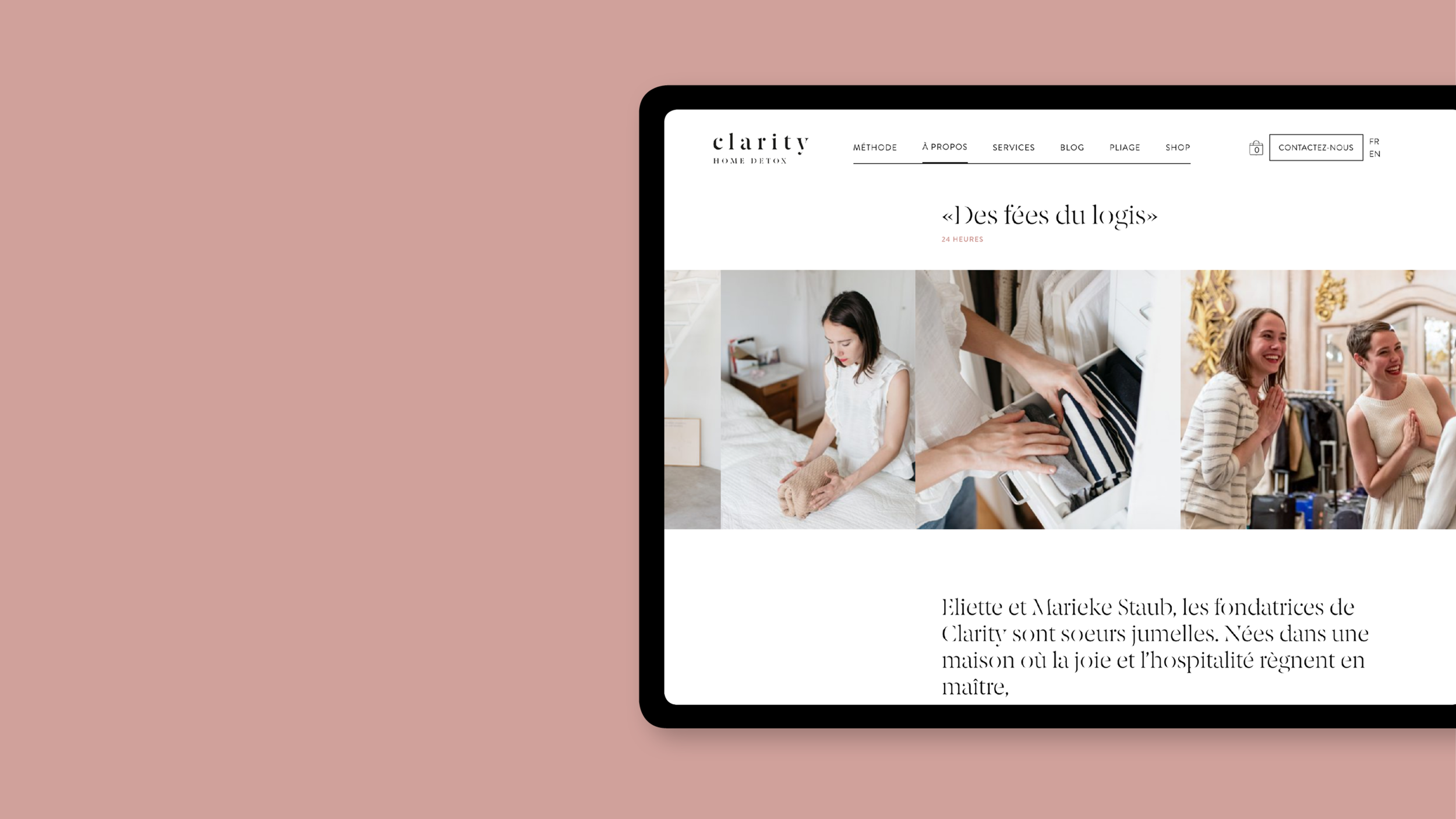
Clarity home detox
Consultantes de la méthode Marie Kondo en Suisse.
Rôle
Branding Workshop, brand identity, packaging, website design, content creation
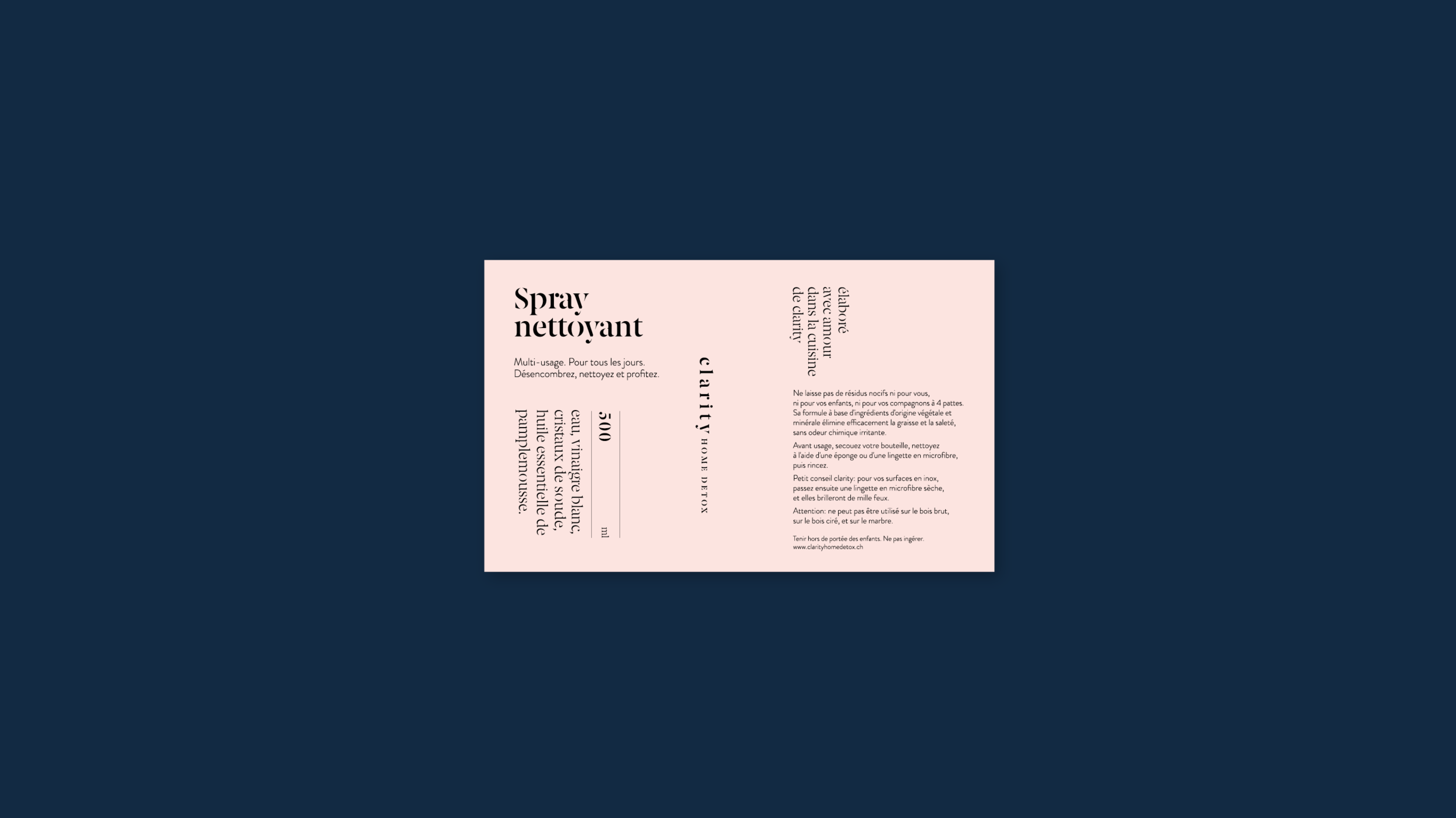
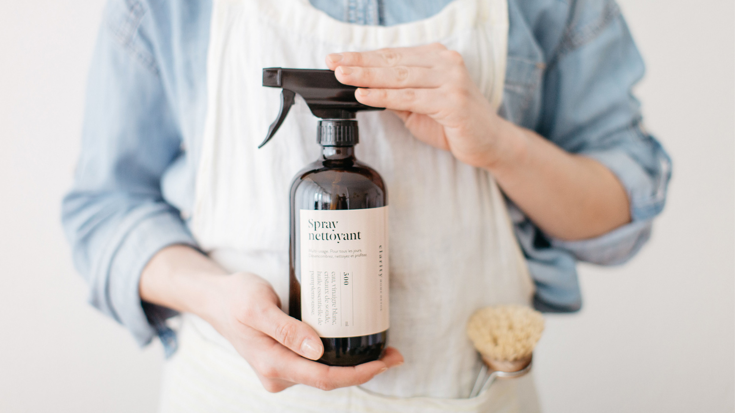
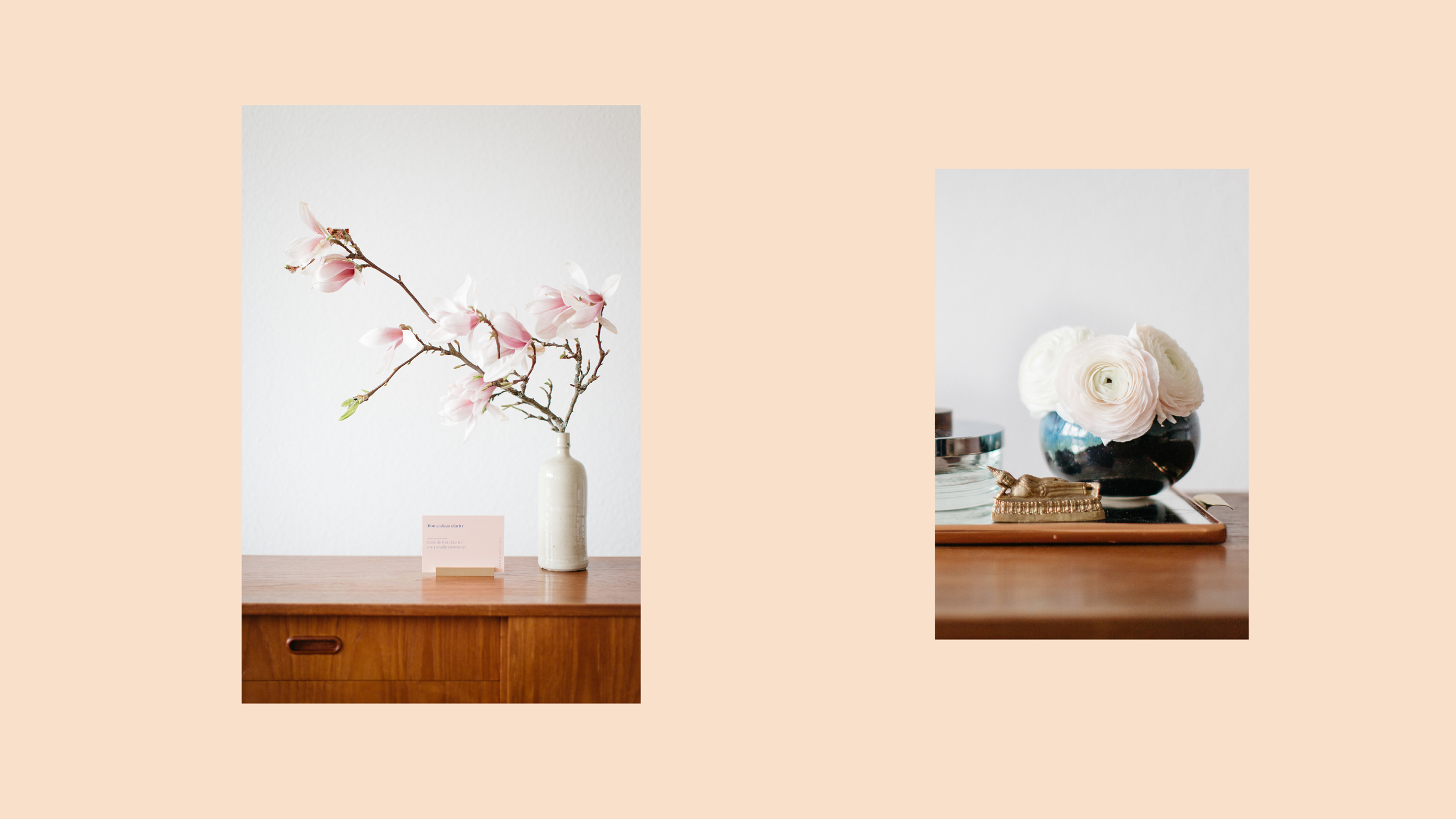
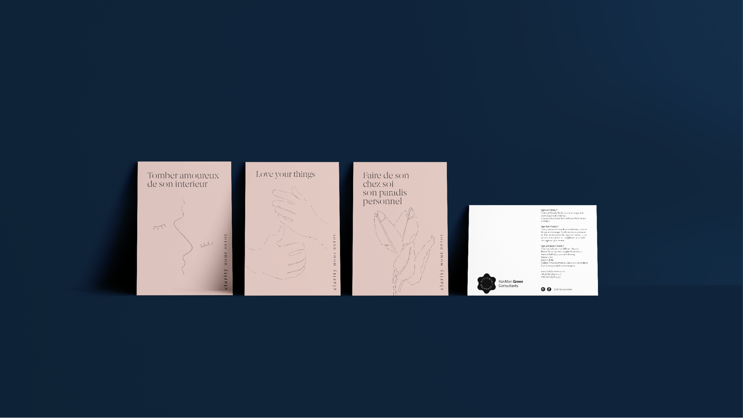
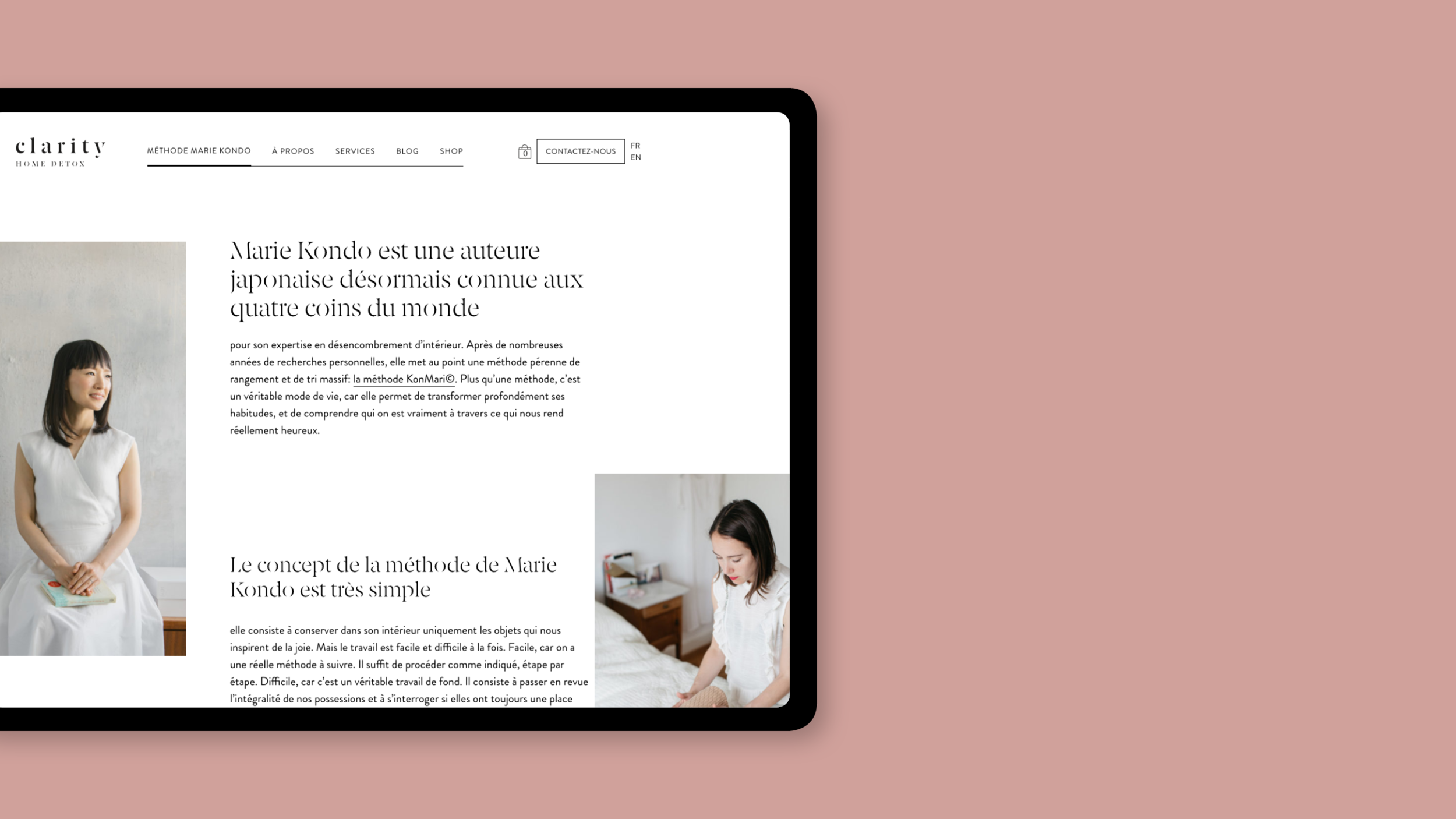
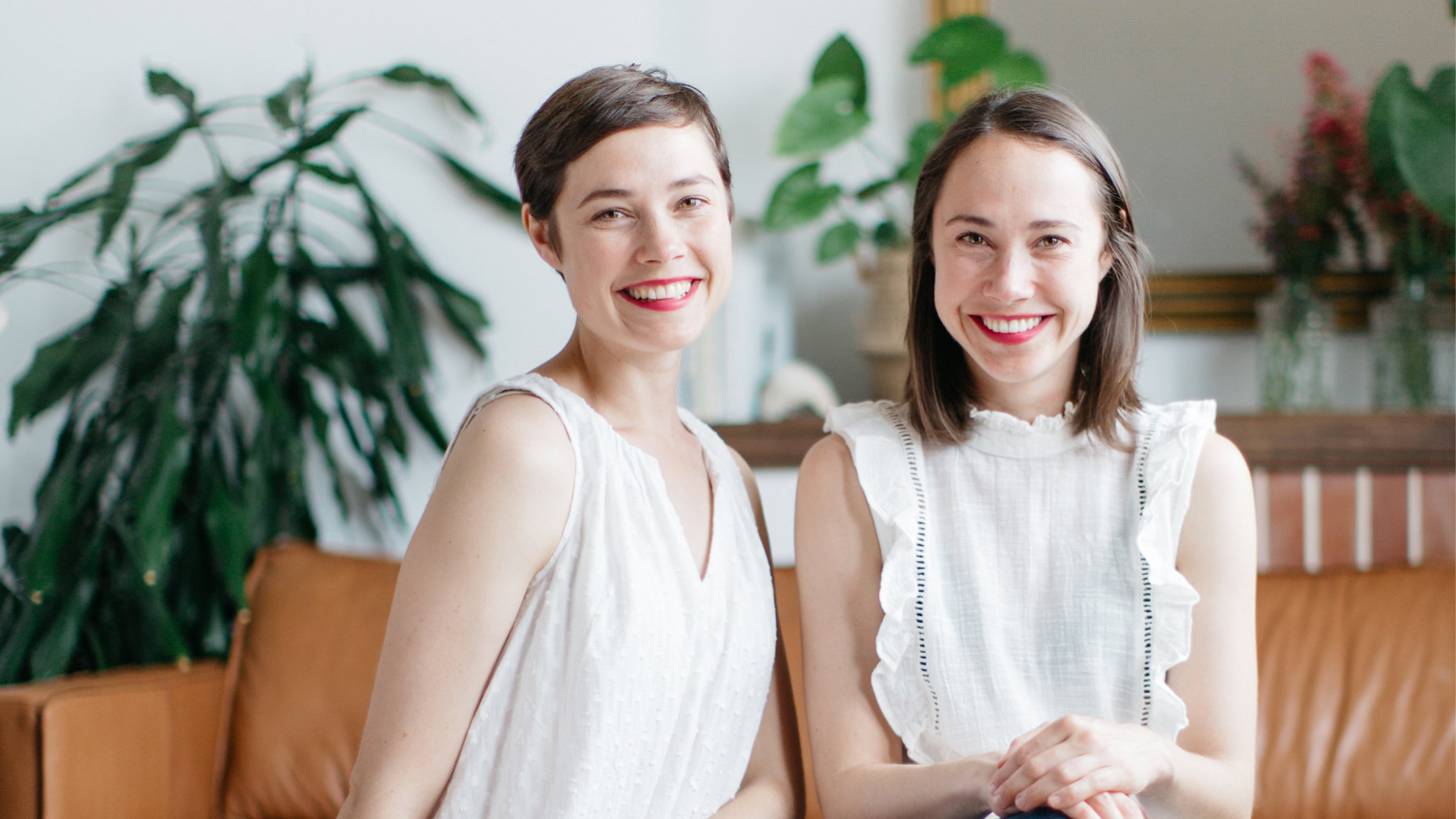
Marieke et Eliette, soeurs jumelles sont habitées par leur passion pour le Home Detox découvert originellement grâce au best-seller de la Japonaise Marie Kondo, « La Magie du rangement ». Avec douceur et bienveillance, elles accompagnent leurs clients dans une remise en ordre de leurs intérieurs, qui souvent va au-delà du simple rangement matériel.
Clarity vous propose en fait de retourner à l’essentiel, parfait point de départ pour traduire en image le projet d’Eliette et Marieke.
Le logo de Clarity est composé d’un caractère typographique calligraphique rappelant l’esprit méditatif et introspectif nécessaire à l’accomplissement d’un home detox. Celui-ci, positionné à la verticale c’est un clin d’oeil au kanji japonais où l’encre, d’un noir profond, vient se poser sur une palette de couleurs douces et naturelles.

Make Space
Make Space, showcases conscious design and contemporary crafts
Rôle
Branding Workshop, brand identity, website design
Les lignes architecturales et les textures minérales sont à la source de l’inspiration pour l’identité visuelle de Make Space. Une palette de couleur composée de couleurs naturelles éclairées par une lumière diaphane a été choisie pour mettre en valeur la ligne éditoriale de Make Space journal. Spécialiste de la communication Make Space réalise des contenus sur mesure pour les marques.


Pavillon
bar & café
Rôle
Brand identity, menu, carte visite, cartes postales, site web
Le Pavillon Bar petit trésor dissimulé sous le parking de la Riponne, dans une ambiance feutrée de cabinet de curiosité où l’on y sert des cocktails délicieux.
Pour complémenter l’identité de ce lieu, d’une part nous avons créé un set d’illustrations botaniques inspiré des 4 saisons et d’autre part, l’enseigne en découpe de laiton donne un côté précieux à ce petit bijou.


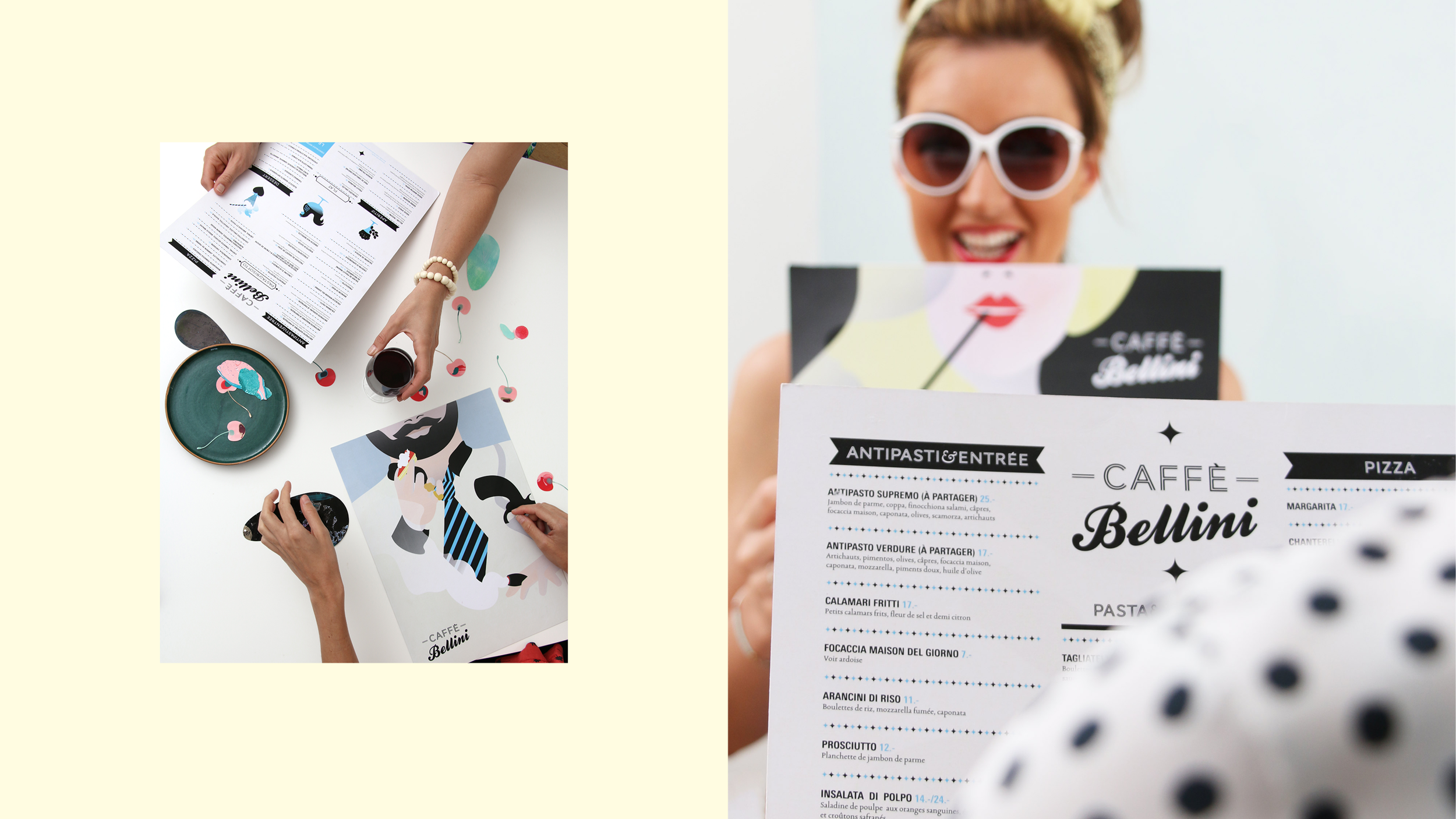
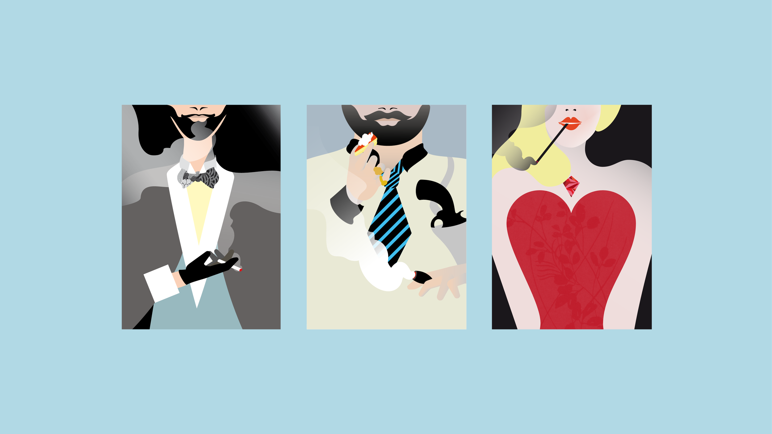
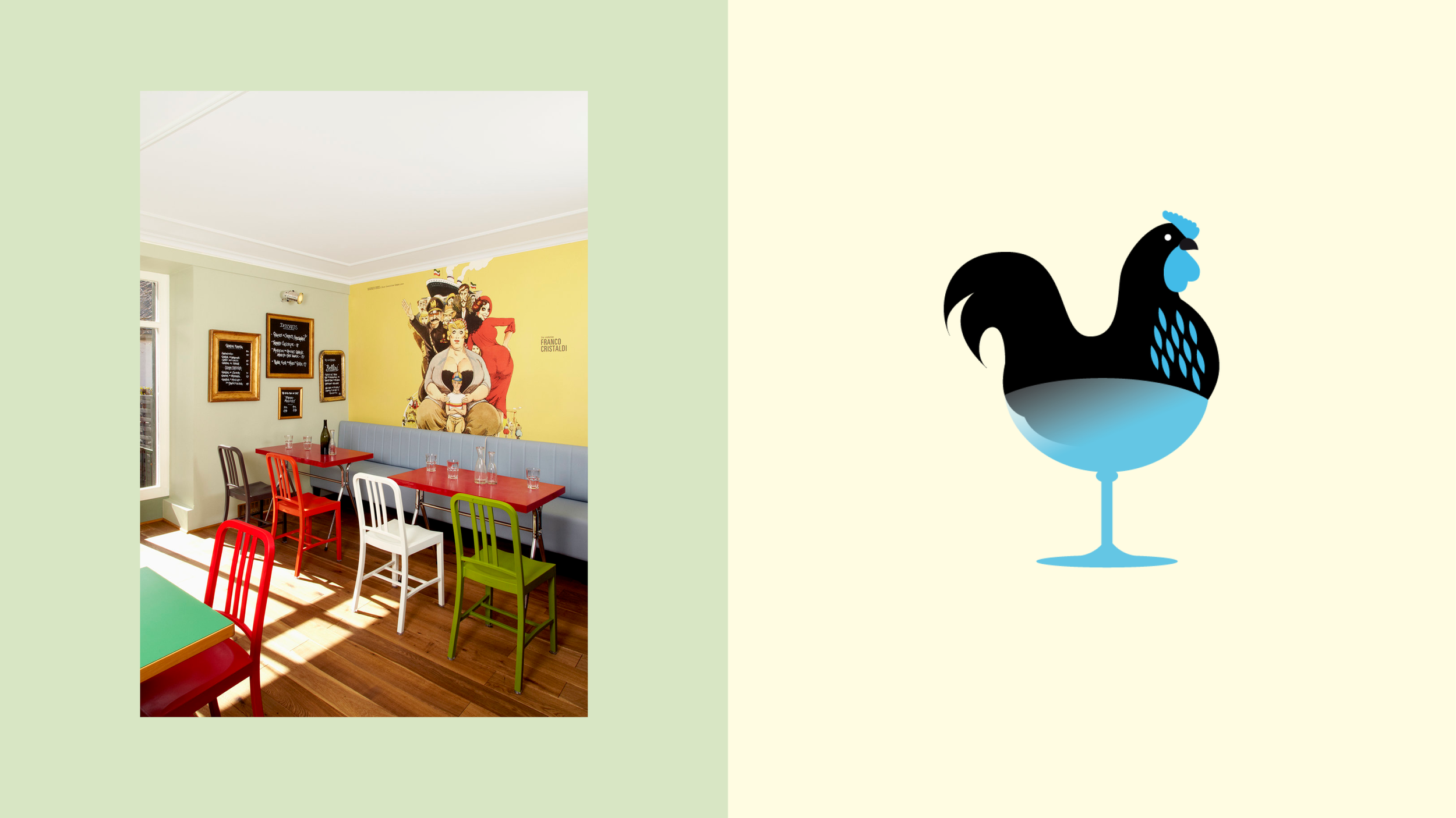
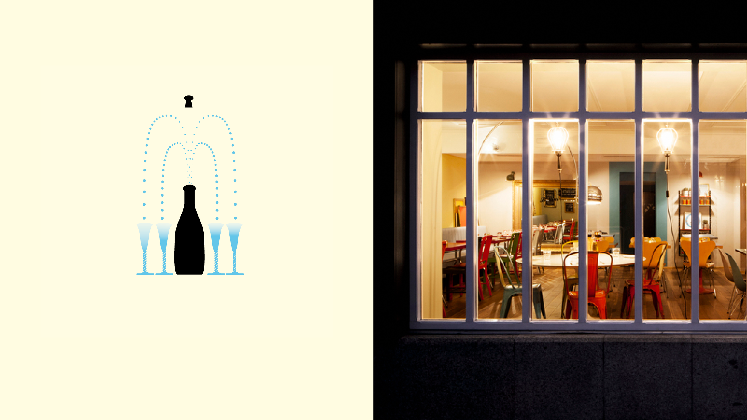
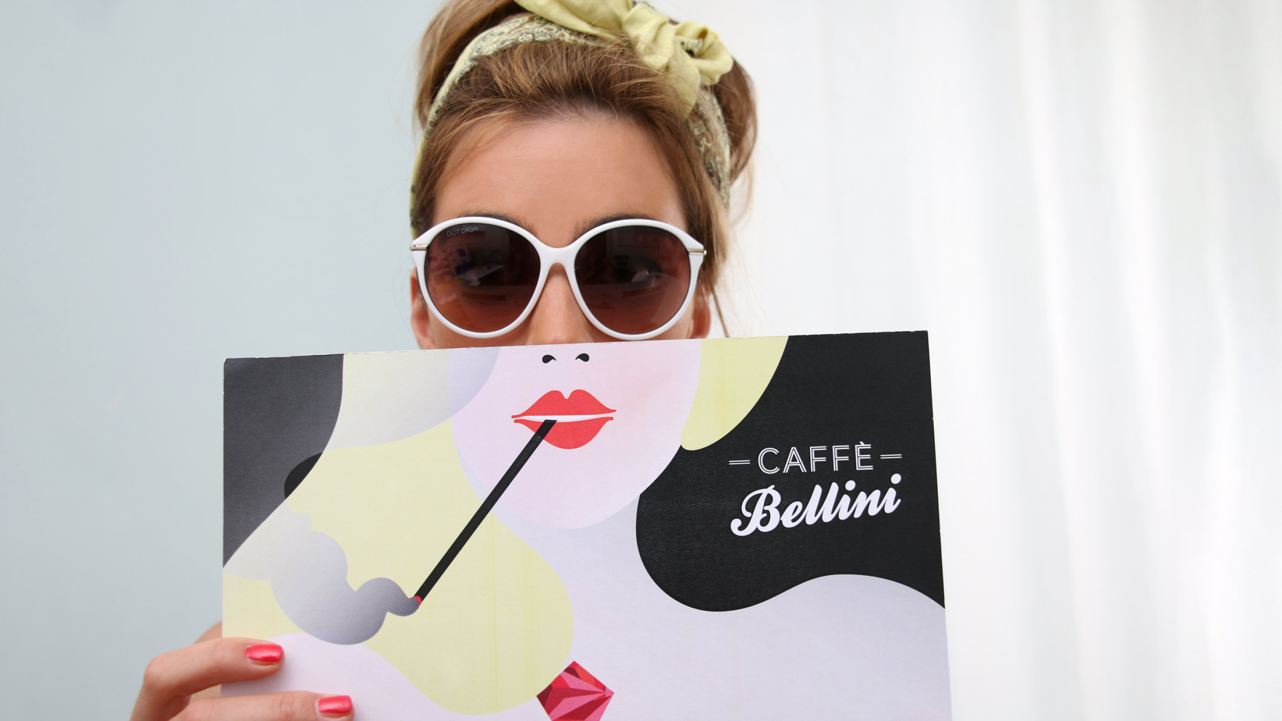
Caffè Bellini
Rôle
Brand identity, menu, signage
Le café Bellini est un lieu convivial, une cantine italienne.
Pour l’identité visuelle de ce lieu nous avons choisi de créer des menus représentant des personnages grotesques issus de films italiens.
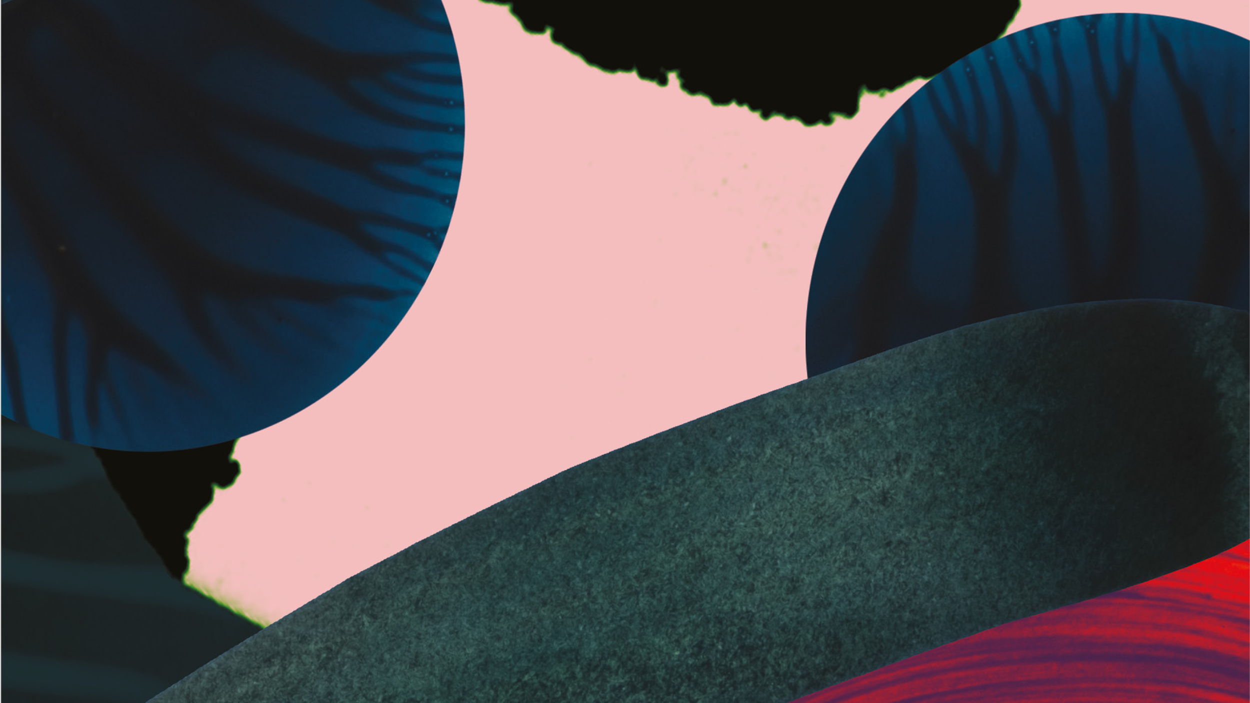
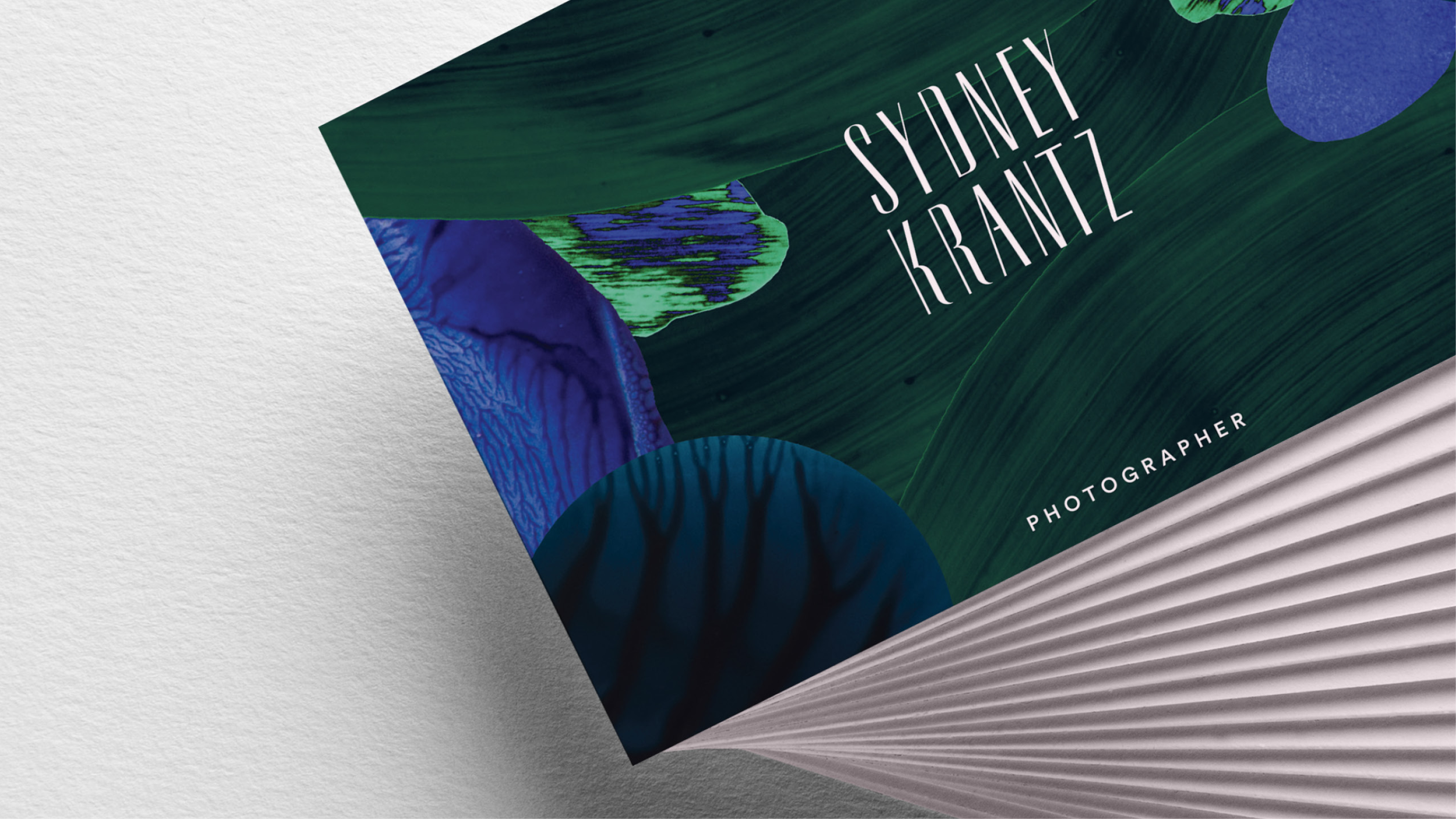
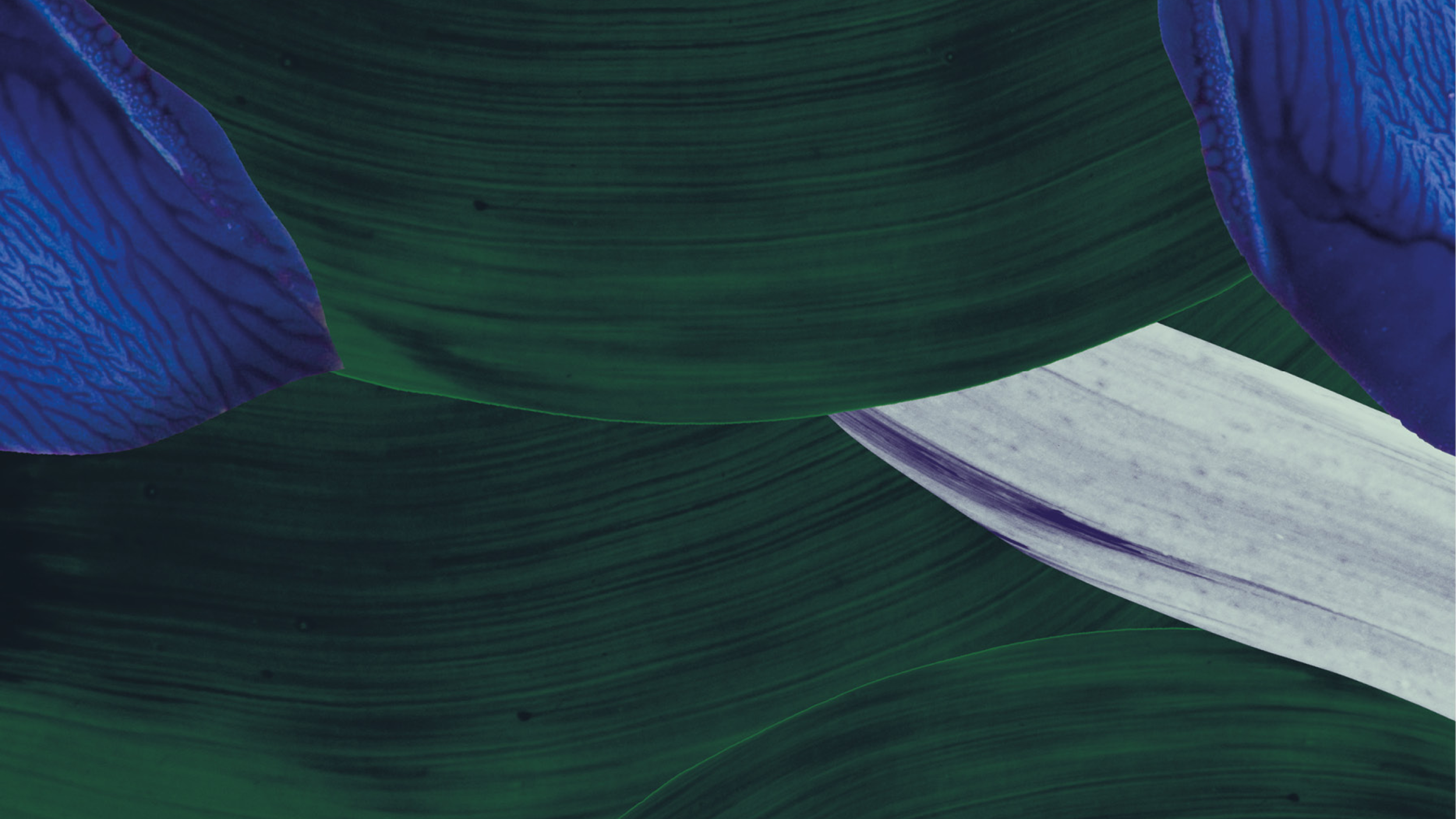
Sydney Krantz
Rôle: Identité graphique, carte visite
Sydney Krantz est une photographe basée en Californie son travail est inspiré de la nature et la mode. Nous avons eu carte blanche pour son identité.

Pattis France
Rôle
Workshop about the brand values, social media
A visual identity may not be enough sometimes. In order to make it blossom, you need to breathe life into it. Hand in hand with Anne-Sophie Garnier Noirhomme from Paris agency La Toolbox, we helped Norah and her team at Pattis France step up to this challenge.
I have been designing brand identities for more than 10 years now. My mission includes supporting my clients in understanding the potential of their brand. A branding concept goes beyond a logo and a few posters, it is the sum of all the tiny things that clients and partners will see of your company. It is a wide open window on your company’s universe.
Pattis France was trying to establish itself as a leading place for food, culture, sophistication and "art de vivre". They had a solid branding guide and an appealing motto, but they struggled to go beyond them to forge their online presence. Anne-Sophie and I went onsite in Saudi Arabia to bathe in the Pattis universe so we could craft together the future of their communication.
They struggled to go beyond them to forge their online presence.
Defining one’s identity always boils down to this very question: "Who do you want to be?". Through our first workshop together, we asked ourselves this question, but I wanted to go further. Which role do you play locally? Which heritage are you a part of? How can you harness it?
In a few hours together, we tried to go beyond what Pattis was. It is not just about food and art, it is about telling the story of how Pattis sees them and chooses to promote a certain vision of them. It is about how Pattis contributes to a local culture, to a territory. When collaborating with partners on such projects, one of my aims is to help them gain awareness of the role they are playing on a local scale and to embrace it, to do it with good heart. For example, we imagined which partnerships Pattis could tie with local artists, craftmen and women. That is how the idea of collaborating with local designer was born.

We built a time-related and sustainable base of inspiration that the team could use to write Pattis’ story on social media.
During the workshop, I chose the metaphor of seasons and the calendar so Norah and her team could see things from a brand new angle. We went further on this idea by imagining Chinese portraits for each month in the year. We built a time-related and sustainable base of inspiration that the team could use to write Pattis’ story on social media.
A lot of communication has to do with the material at your disposal. We spent time building the inventory of all the things that could contribute to drawing the Pattis universe, and that goes way beyond beautiful dishes in spotless pictures. Decoration, kitchenware, lamps, flowers, bookcases, architecture of the city, life and stories of the people in and around the company, but also moments of the day and how Pattis was applying its special touch to them.
By widening Norah’s view of her own branding universe, we were allowing her to harness the whole power of her brand.
A good brand, infused with culture, values, creativity and solid visual material gives many possibilities to their owners. By helping them, my purpose is strategic and inspirational: by widening Norah’s view of her own branding universe, we were allowing her to harness the whole power of her brand, as well as her own. "I feel so much better now, I feel cleansed", she said at the end of our five-day workshop.
My purpose throughout this project was to bring the Pattis identity alive and help Norah and her team feel empowered to embody it, and develop it with a creative and strategic mindset.

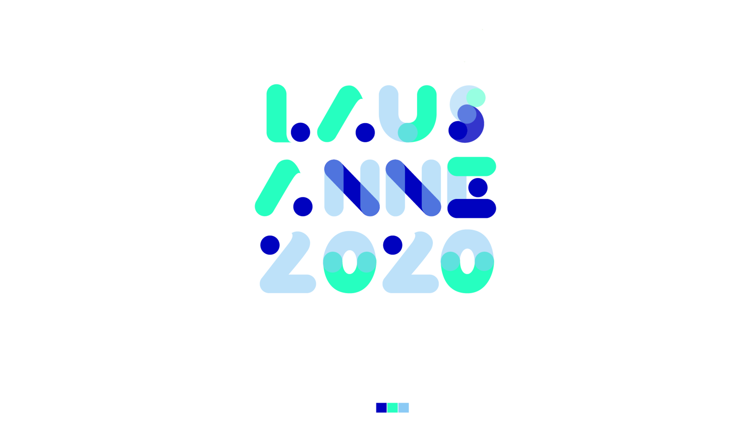
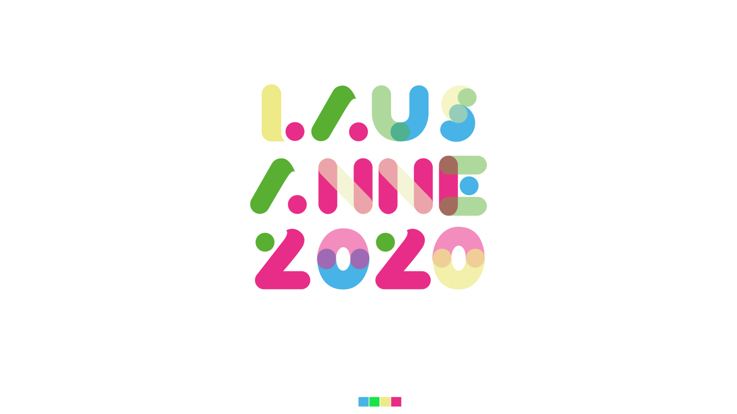
JOJ 2020
Rôle
Dessin de logo
Au cours d’un mandat chez Did We Do, Sara Thom a dessiné les ébauches d’un logo qui est aujourd’hui le logo officiel utilisé pour les Jeux Olympiques de la jeunesse – de Lausanne 2020.


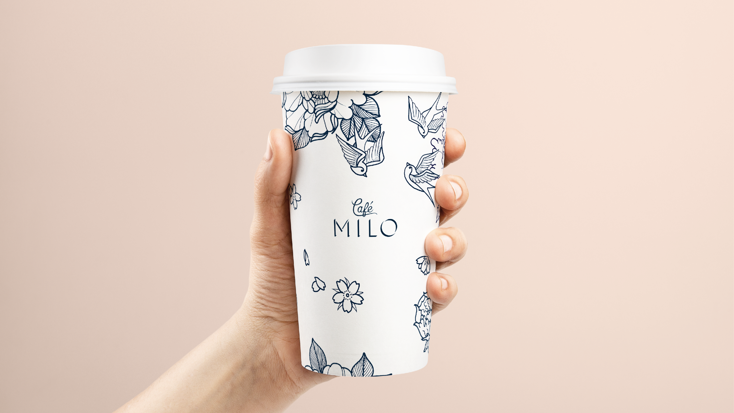
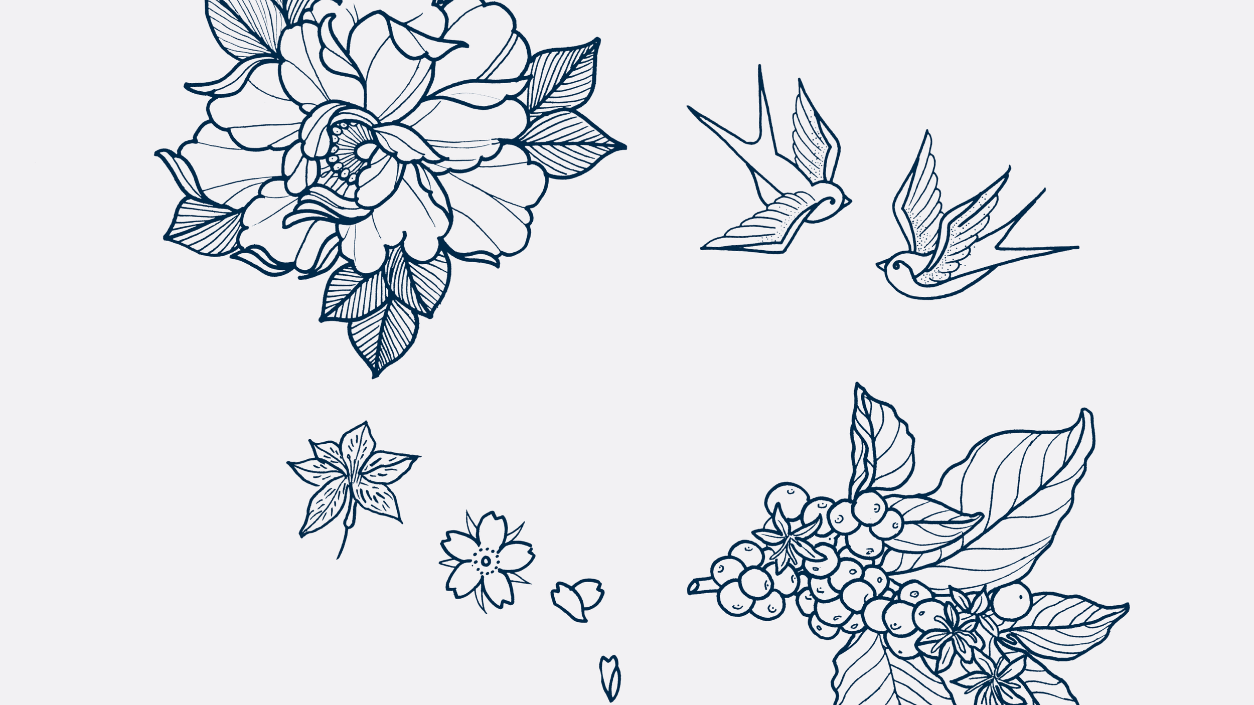
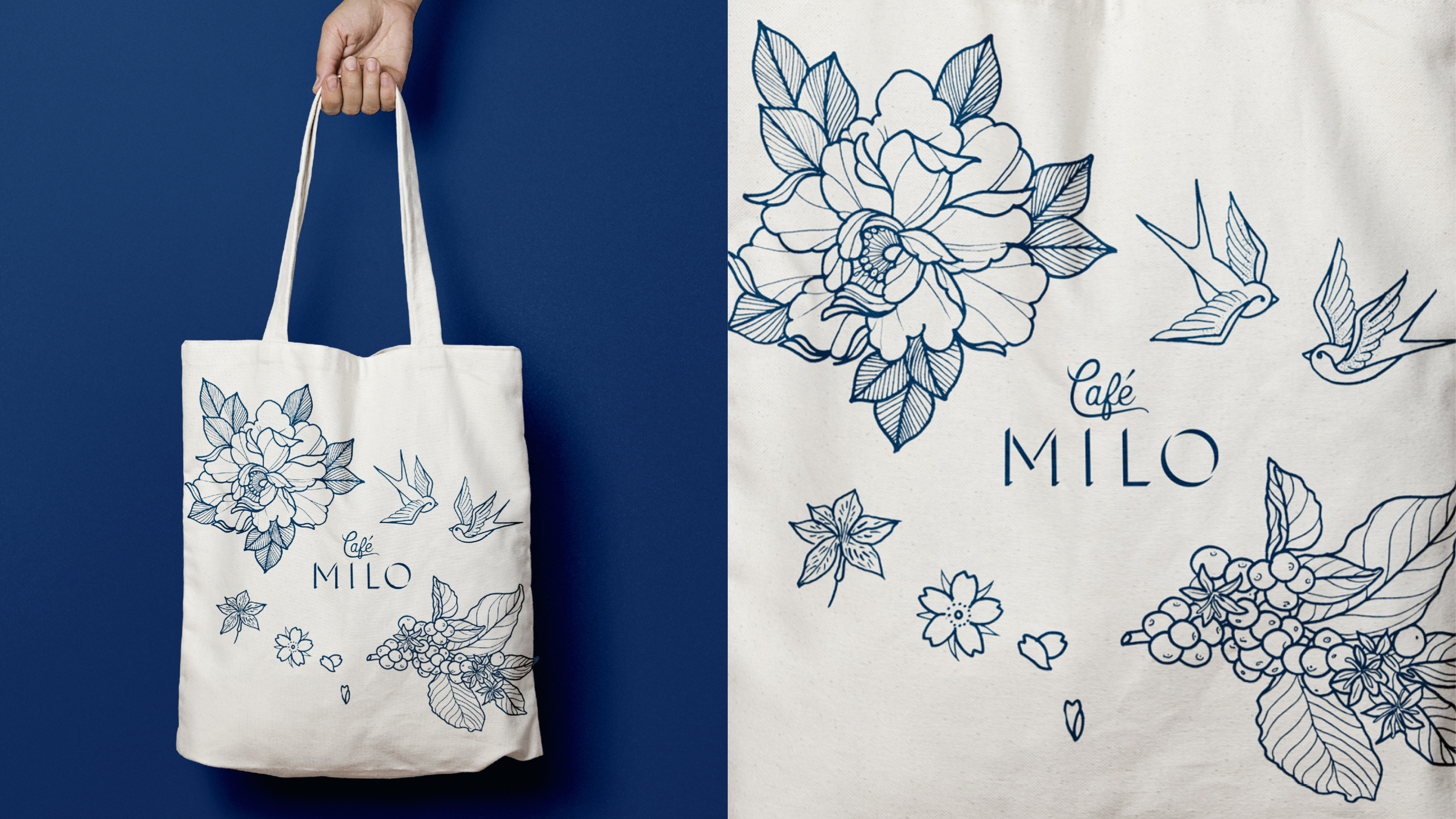
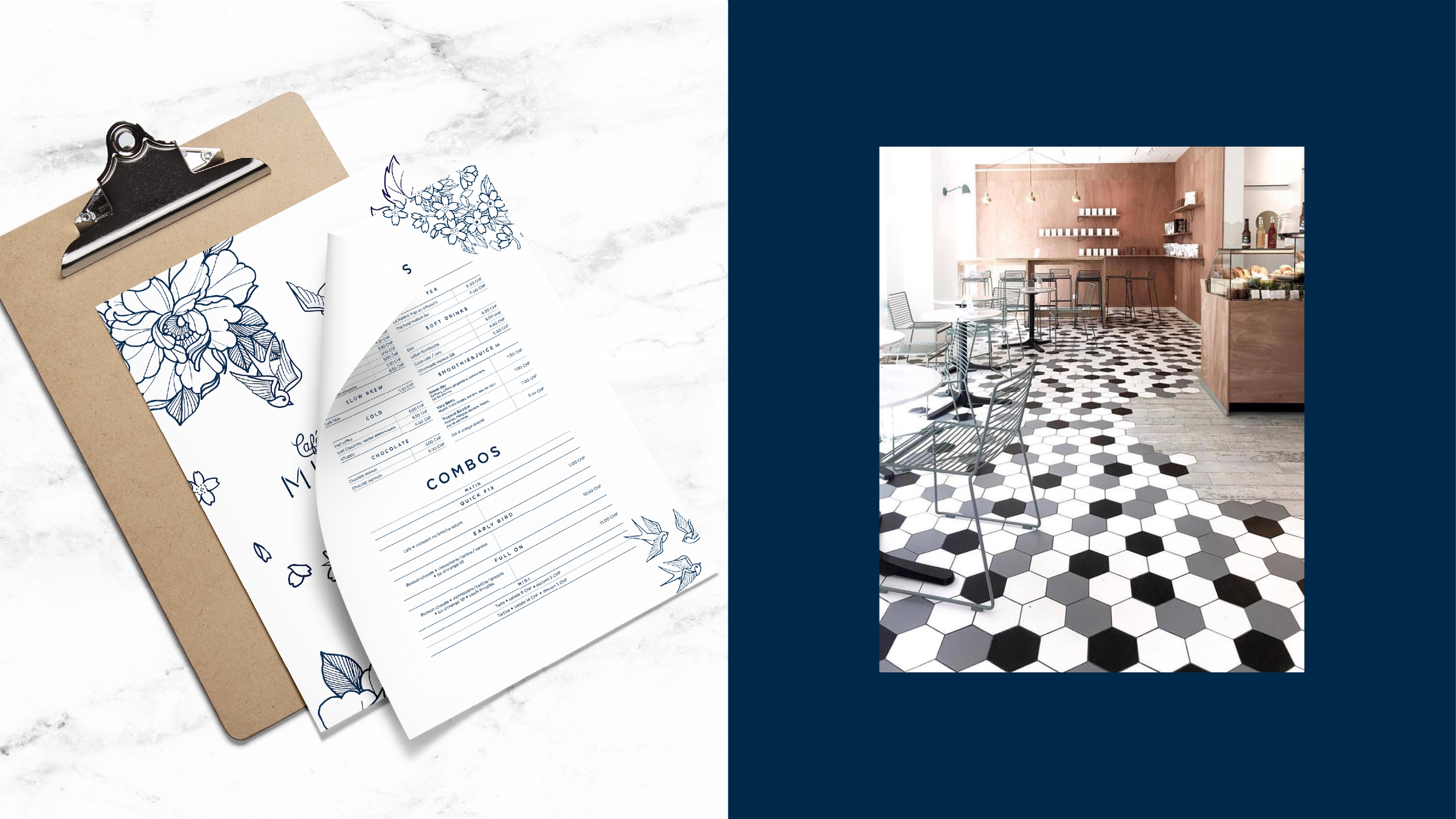
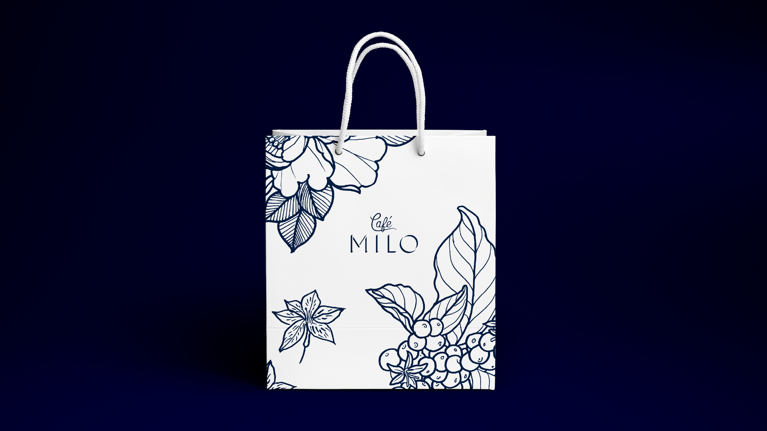
Café Milo
Rôle
Logo design, illustration, bags, menu
Café Milo est une petite chaîne de restauration avec deux adresses à Nyon, une à Rolle et une à Mies.
À l’origine Café Milo s’appelait Pain et Brioche. J’ai été mandaté par Julia Christ en charge du projet de rénovation de cette chaîne pour recréer le logo et la charte graphique de ce lieu. Un motif sur mesure a été créé pour habiller les différents éléments de packaging. Sac, tasse et papier d’emballage alimentaire.